
Let’s talk about colors! You can have the best composition with marvelous design elements, great typography, and spectacular animations. Nevertheless, your design will still be a failure, if the colors you have used don’t fit together or don’t support the overall message of your design. Colors are important! Their impact on your audience shouldn’t be taken lightly. Although not everyone is a professional in color theory, almost everyone has a subjective opinion towards colorations, which has a huge influence on the success of your work.
The influence of colors
Different colors have different influences on their viewers. They can evoke emotions and can contribute to support a certain feeling. That’s why the effects of colors are so essential for every art form. The way color influences the viewer depends on several factors: the personal relationship to a certain color, the viewer’s cultural, political, and religious background, and of course the viewer’s age.
Balance
Color temperature, the arrangement of colors, and how much color is being applied are all factors that play an important role. Balance out your colors! Warm colors have more visual weight than cold colors. If you, for example, create a cold, blue area on just one side of your design, you could balance your composition with a warm element on the other side. According to the rules of visual weight, the warm element can be much smaller than the cold one and still achieve a balance. That way, you can try out different arrangements and judge them by their visual weights.
Adjusting colors
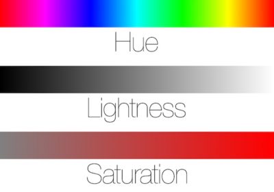
A color’s hue is essential for a color’s character. But not only the hue has an influence. The lightness and the saturation of a hue, also affects a color’s message. A bright blue with a high saturation has a much more friendly and optimistic character than a dark blue with less saturation. Darker colors can be threatening but also very elegant. Reducing the saturation of a pure color also reduces the strength of its original character. Therefore, it becomes much more universally usable.
Combinations
While combining different colors within your design, you should keep in mind that consequently, you also combine the different meanings of these colors. Therefore, a combination of two, three or even more colors always tells another story than the use of just one color would. Another vital aspect that affects the personality of a color is its relationship to other colors. Mixing colors will also mix their personalities. If you mix a warm red color with a bright yellow, you will get an orange that radiates the warmth of red while having the bright character of yellow.
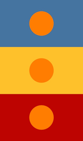
When not actually mixing colors together but arranging them in the same composition, two colors can also affect and support each other. In this context you need to consider the size of the area of a color and its saturation. A desaturated blue area, for example, next to the color orange will make the orange appear even warmer, brighter, and louder. The desaturated and subtle blue area supports the character of the orange. Placing orange next to yellow will define orange as the warmer color. Placing orange next to red will define orange as the colder color. The surrounding colors are as relevant for the character of a color as its own settings.
Quantity
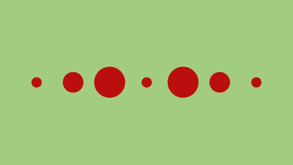
The quantity of a color also plays a crucial part. Larger areas of one color will of course give the character of that color much more power and assertiveness. Smaller areas are weaker and less dominant. That’s why it is a good practice to balance out the visual weight and power of large areas with less bright and desaturated colors. Within small areas you can use stronger, brighter and more saturated colors. Nice trick, isn’t it?
A color’s character
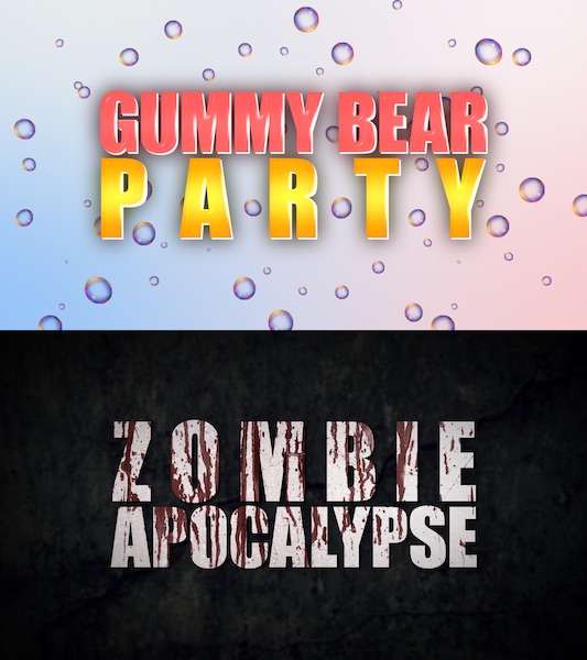
Each color has its own character comparable to the personality of a person. So we basically have a Mr. Blue, Ms. Green, Ms. Red, Mr. Pink, etc. While Mr. Blue has a cold but relaxing character, Ms. Red is warm, ambitious and passionate. Usually Ms. Green is hopeful and fresh while Mr. Pink can be unusually expressive.
Let’s have a closer look at the character attributes of the eight most influential colors. Because the perception of colors depends on every person’s personality and the environment that person lives in, this should only be looked upon as the result of the surveys I’ve made. It is a summary of many opinions and reflects a lot of studies from art theory, but it is of course not generally valid for everyone around the world.

RED
Positive: Fire, Passion, Love, Heat, Energy, Courage, Strength, Power
Negative: Aggression, Blood, Anger, Violence, Jealousy, War, Danger, Rage

ORANGE
Positive: Warmth, Optimism, Activism, Success, Fun, Happiness, Attraction, Creativity, Enthusiasm, Determination
Negative: Cheapness, Frivolity

YELLOW
Positive: Brightness, Energy, Friendliness, Emotionality, Optimism, Wealth, Intellect, Truth, Sunshine
Negative: Greed, Envy, Avarice, Egoism, Deception, Cowardice, Jealousy, Instability

GREEN
Positive: Health, Balance, Life, Hope, Growth, Harmony, Nature, Fertility, Safety, Peace
Negative: Inexperience, Laziness, Poison, Jealousy

BLUE
Positive: Stability, Truth, Loyalty, Faith, Trust, Sky, Water, Wisdom, Intelligence, Duty
Negative: Cold, Depression, Aloofness, Unfriendliness

PURPLE
Positive: Nobility, Serenity, Royalty, Ambition, Luxury, Tenderness, Wealth, Magic
Negative: Superstition, Catastrophe, Solitude, Decadence, Suppression

WHITE
Positive: Light, Innocence, Virginity, Purity, Cleanliness, Goodness, Ease, Perfection, Restart, Success
Negative: Sterility, Emptiness, Anonymity, Coldness

BLACK
Positive: Power, Authority, Elegance, Dignity, Formality, Prestige, Glamour, Security, Efficiency
Negative: Darkness, Death, Grief, Pain, Evil, Mystery, Fear, Menace, Submission
Colors are important!
Try to remember some of these principles and always keep in mind that all colors have unique characteristics and exert different influences on their viewers. To achieve a consistent design, you should choose and adjust your colors carefully and precisely combine them with other colors. If you liked this article and want to support us, please share it with your friends and colleagues! Also check out our ebook to learn more about graphic design and animation!
