It’s an odd thing: You work hours and hours on the best design ever and all that you get to hear from your client is: “It’s kinda difficult to read those words! Can you adjust that?”
Did this happen to me? I fear so. It’s a totally common situation. The problem is that you – as the designer – know the message you want to present with your design inside and out. You know every word. Every letter. Even if you apply some effects that might influence the crystal clear look of your font.
Your mission is to illustrate the message as effectively as possible. And sometimes this happens to the disadvantage of legibility.
That is why one of the most crucial aspects concerning typography is to achieve a balance out of legibility and the (hopefully) extraordinary design of your words. You may have the world’s most beautiful typeface but your motion design will still be a flop if nobody can decode your words.
We have to balance good legibility on the one hand and an appealing design on the other hand.
What should we keep in mind to maintain good legibility?
1. The typeface itself
Needless to say that the first big factor that decides about legibility is the typeface itself. Typefaces that we are used to – like the serif typefaces we know from books or simple sans serif typefaces – are easier to read than rather unknown typefaces and especially script typefaces.
However, if you only have a few simple words within your design, it normally is no problem to also use more extraordinary typefaces if you keep the legibility in mind. For example, you can increase the size of unusual typefaces or make their animation slower to improve their legibility. Always give your audience a bit more time to read everything than you would need (because you already know the text).
If you have to incorporate longer texts in your motion graphics, it might be a good idea to simply choose a typeface that your audience knows – like the ones being used in newspapers and books – and unfold your creativity in another segment, rather than with extraordinary and complex typefaces.
2. Size
Size also matters! The bigger your letters, the higher the chances that your audience can read everything. But be attentive not to exaggerate the sizes. Large, full-screen words always tend to be inelegant, intrusive and much too striking. This might be what you want to achieve sometimes, but it’s normally not the best way to gain the attention of your audience.
What you also have to keep in mind is that you can’t use every typeface at every size. Especially thin sans serif typefaces, they are perfectly readable in a smaller size. If you make a thin typeface really big, your words will become highly unstable and will get lost on the screen. If you plan to have big words, a bold typeface with thick strokes might be much more purposeful.

3. Tracking
Changing the tracking (the distance between the letters of a word) can also influence legibility. If it is too small, it might be that your letters blend into each other and can’t be perceived as individual symbols anymore. On the other hand, if you have too much tracking, your words will seem to fall apart and the eyes of your audience will be too busy collecting the letters like spilled marbles.
![]()
Depending on the size of your words you should always adjust the tracking accordingly in order to improve legibility. Most times big words need to have a smaller tracking, or their compactness will get lost. When working with small caps or capital letters – which makes your words much more dense – it might also be a good idea to increase the tracking to support legibility.
4. Position
When combining your different elements, it is necessary to choose the positions of your text elements wisely. Don’t fill up your screen with text for the simple reason that there is enough space on it! Give your audience free screen space to rest in and to orientate and arrange your words in an appropriate way.
Normally, your audience will read from left to right. Starting from the position of your eyecatcher you should lead the eyes of your audience over your text. With the help of transitions and animations you can tell them which words to begin with and which ones are next.
5. Animations
Animations also have an influence on legibility. Fast moving words attract attention but are not as legible as slow or static text. Give your audience time! Try to predict how they will behave and how they will look at your design. Find the best way how to lead them through your work so that they can read and understand everything.
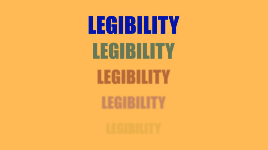
6. Contrasts
The last aspect I’d like to mention is pretty obvious and concerns the contrast between your text and your background. To make it short: The more contrast you have, the better your legibility will become. That’s why paper is white and text in books is black. And that’s why 98% of all movies end with a black screen with white text on it. This is the best way to present huge amounts of text to an audience. Simple and comprehensible.
But since we, as designers, don’t content ourselves with simple black backgrounds, we again have to find a good balance out of legibility and exciting designs. If there is text on screen, I’d refrain from making the background too chaotic or your audience will be distracted from the relevant parts of your design.
Also try not to repeat the colors of your text exactly behind your text or your background and your words will blend into each other. Important text should always contrast from the background as much as possible.
Conclusion
Always keep in mind that your audience has absolutely no idea of what it is about to see before watching your motion design. While you have spent many hours working on your design, for everyone else it is a completely new experience. Give your audience a clear design and enough time to understand what they see.
I hope the above-mentioned aspects will be a little help for you! You know more things that have an influence on legibility in motion graphics? Please post them below this article and we’ll include them as soon as possible!
If you liked this article, you would do us a huge favor by sharing it with your friends and colleagues! :-) Also check out our new ebook to learn more about graphic design and animation!
