Do you know that situation: You’ve created a new design. The colors are great, typography is perfect and your graphics fit to the message you want to tell. However, something is strange. Somehow your design is inconsistent.
Are there too many objects on the left half of your composition? Or are the elements in the bottom half too small compared to the rest of your design elements? Every element (be it a word or an illustration) has its own visual weight, that is defined by the position, size, brightness, contrast, complexity, velocity or color of the element.
To get a visually appealing design, it is crucial to balance the visual weight of your elements or you will get an unstable composition.
The Visual Weight
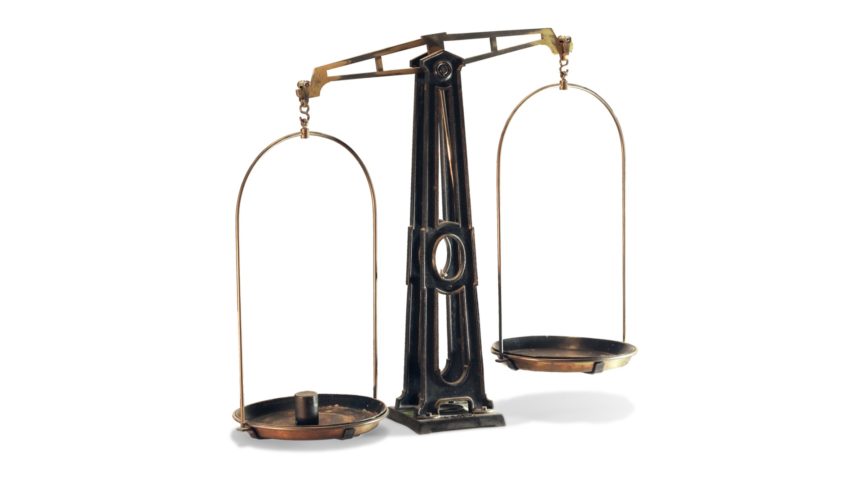
Compare your image to a traditional balance scale that is fixed in its center and that moves one of its sides up or down according to the weight of the other side.
Your composition follows the same rules. Its visual appeal is depending on its inner balance. So imagine your image only being fixed with a nail in its exact center. In which direction will it turn? If it turns clockwise, then you have too much visual weight on the right side. It turns counterclockwise? Then you have too much visual weight on the left side. If it stays in place (and you haven’t heard of the importance of balance before) you either are a natural talent or you have used two nails to hang it.
In case your image turns, try to adjust your visual weight. Move some objects around, change their sizes, brightness, contrast, complexity, velocity, color, their distance from the center (Another analogy to the balance scale! Moving one of its sides towards the pivot point of the balance scale will make that side and its content “lighter”. Yeah, physics!) and so on.
Symmetry and Asymmetry
While adjusting the visual weight, pay attention to not making everything too symmetrical and that you don’t use too much similar elements. This would make your composition harmonic BUT unfortunately could also get quite boring. Your audience will tire of looking at it quickly.
Balanced asymmetry is the key! You need disharmony through different elements and asymmetry to create tension! If there is a big, heavyweight element on the right side for example, use many complex, midsize elements on the left side to compensate for the big element. Nice trick, isn’t it?
Axis
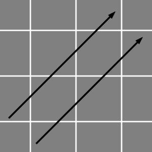
Another help to establish balance and a structured composition, is the usage of vertical and horizontal axis. By placing objects on the same axis of your grid, you create a visually attracting order that the eyes of your audience can hold on to. Vertical and horizontal axis make your image stable and give it a confident character. BUT (written in capital letters), heads up! Boredom ahead! You should also arrange elements on imaginary diagonals that break up those static axis and create tension. This is an old rule of classic art. Horizontal and vertical axis for stability and diagonals for tension. You can find that everywhere!
The Rule of Thirds and the Golden Ratio
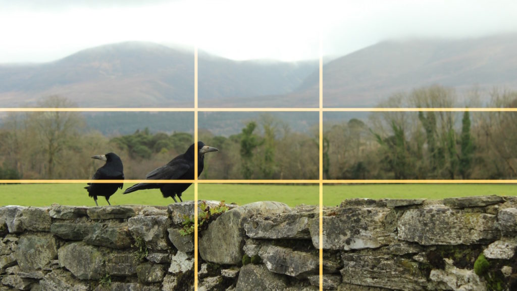
Talking of things that you can see everywhere: Did you ever hear of the rule of thirds? Perhaps you have not heard of it yet, but you definitely have seen it, directly or indirectly.
If you want to balance your objects quickly (for example you take a picture of a dog and a flower in front of a blurry background) it is better to not perfectly center your composition on your eyecatcher for the sake of balance. You get a much more exciting and professional look by shifting your shot slightly apart.
With the rule of thirds you split the image into three parts horizontally and vertically and therefore get a clear, rough grid. Now you simply have to put your subject on the lines of that grid. This will result in a perfect compromise of balance and tension. I am pretty sure that you are already familiar with that grid. It is a component of most cameras’ viewfinders to simplify the process of composing a shot for the photographer. Quick and easy.
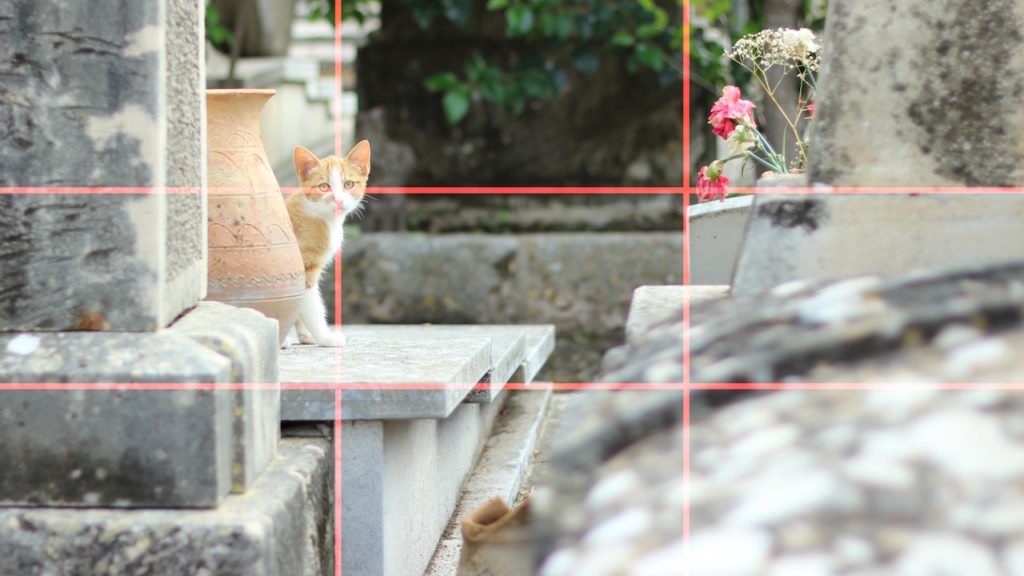
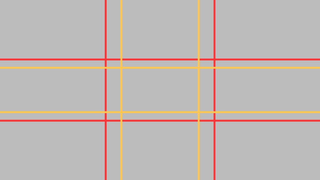
In case you only have one object, I would prefer balancing it in the proportions of the golden ratio because the rule of thirds would shift your object too much apart.
(Proportions of the rule of thirds: 1:2 (red grid) – Proportions of the golden ratio: 1:1,6 (golden grid) – see figure)
I hope you’ve found this article useful! If you know more ways to balance a design or a picture, please post them below this article and we’ll include them as soon as possible!
If you liked this article, you would do us a huge favor by sharing it with your friends and colleagues! :-) Also check out our new ebook to learn more about graphic design and animation!
