Although the processes of making a movie and producing a motion graphic have many things in common, I think that there is at least one aspect that is extremely different. When filming a movie, a professional film crew will always strive after perfection. Everything has to be clean and technically at the highest stage. The pursuit of perfect lighting conditions, perfect camera movements, perfect makeup, perfect CGI are only a few examples of how modern movie productions try to achieve their perfect look.
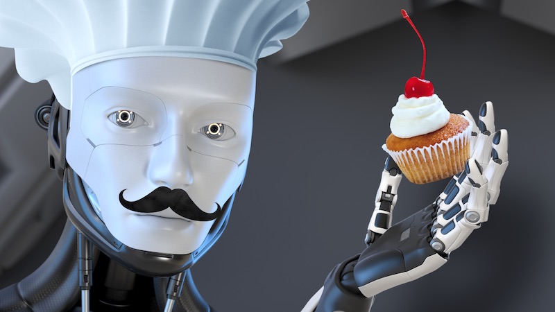
Filmmakers always fight against imperfections in their footage, while good motion graphic designers should deliberately create imperfections. And I’ll tell you why: what we create is artificial by nature (I know this sounds strange). We manipulate pixels. We technically generate images with the help of a machine. And what is produced by a machine can initially only look artificial. Can only be perfect.
Fight perfection
That is why – contrary to the filmmaker – we have to fight perfection. So, unless you are working on a design that shall deliberately have an artificial look, you should always try to make your design look natural and organic in order to make it plausible for your audience and to smother the fact that it has been created by a computer. Give your design some naturalness by using elements from the real world! Don’t constrain yourself to techniques that only try to simulate natural behaviors. You cannot recreate nature digitally. That is a contradiction in itself. To sum it up: Create imperfections to achieve the perfect motion graphic!
Let’s have a look at the 5 ways that give your motion graphics more naturalness and learn how to create the perfect imperfections by using elements from the real world!
1. Avoid plain colors
At first, digitally created graphics always look too clean. It’s all about adding some defects, randomness and other characteristics of nature to your static design and animations. The first thing I’d like to mention here is that you should avoid flat-looking elements and especially elements with large areas of the same color. Again: if you plan to create a design that demands a flat look, you are good to go with that style. But if you want to achieve a more natural and realistic look, I would try to avoid it. Nothing in real life consists of only one plain color. There are always at least slight color changes, scratches or other imperfections in the surface of an object.

2. Light
Another valuable aspect is to work with light. Light is everywhere. In real life it decides about what we can see and what remains hidden in the dark. With light effects you can enhance the realism of your design and make your elements and layers blend together nicely. It might not be obvious at first sight but light can also have a very diverse character. Light can be warm, it can be cold. It can be shy, aggressive, subtle, intrusive, etc. Use these characteristics to support the message of your motion graphic! There are many different types of light effects that do all serve a specific purpose. These are only a few examples:
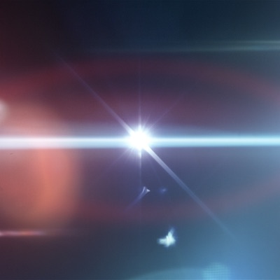
Lens flares: who doesn’t know lens flares? What was formerly an unwanted artifact (caused by unavoidable inaccuracies in the lens of a camera) is currently a common stylistic device to highlight elements, make them bright and shiny and to add an organic layer on top of a design. The look of a lens flare is defined by the light source, its position and the type of lens that is being used to capture the lens flare.
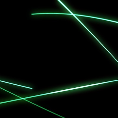
Light trails: light trails can be produced with fast moving light sources. The resulting trails are extremely aesthetic and can for example be used to underline or to surround elements. Light trails can be created with particle systems or with real light sources. This is an intrusive effect that cannot be weakened easily. So use it with caution and only if that style matches your design.
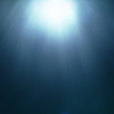
Light rays: a foggy or dusty atmosphere can make the rays that emit from a light source visible. The result is a volumetric light that can transfer the dense atmosphere from which it originates onto your motion graphic. Furthermore moving light rays can also add life to your art. Light rays from above always have a godlike character. Elements that are positioned beneath such light rays get pointed out. In contradistinction to the fast moving light trails, light rays are normally much more comforting and subtle.
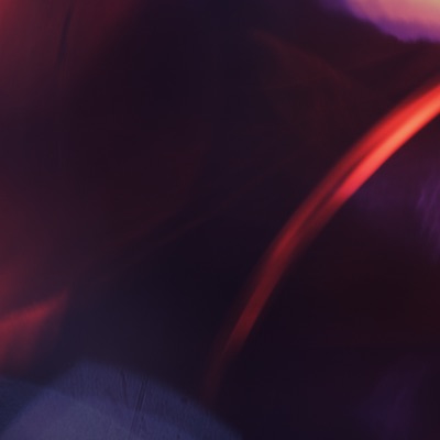
Reflections: light that is being reflected on shiny objects creates beautiful images: Light reflections. The unique combination of sharp and blurred elements is the key feature of that effect. Apply light reflections to your design to give it a special and artistic look.
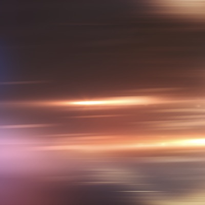
Light speed: other than light trails (that develop from moving light sources), a light speed effect can be created by moving the camera itself. This is a famous effect for transitions between two scenes to show that time has passed quickly. To include that feeling of speed you can also try to blend a light speed effect on top of your whole design or into a certain element.

Light leaks: some of you might know a subcategory of this effect as the classic film burn effect. It is the effect that appears when light (or even fire) mistakenly enters your lens or movie projector. What once was an unwanted technical fault is now a popular stylistic element. Depending on the exact style and especially the speed of the light leak it can make your image either smooth or nervous and strained. You can use light leaks to give your image character and to define certain parts of it.
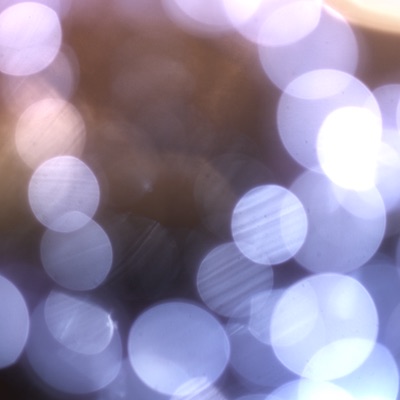
Bokeh light: other than the previous light effects, bokeh light is normally used in the background of a design. Exceptions confirm the rule. Footage of bokeh light shows unsharp light sources or reflective objects. They can be static or they can be in motion. Bokeh light is defined by the light sources themselves and by the type of lens (and its aperture) that captures the light. Because of its blurred and subtle character it can be used to highlight the elements that are positioned in front of it.
As you might have noticed some of these effects are originally image artifacts that traditional cinematographers would always try to avoid. But as I have explained before, we can use these artifacts to enhance our designs. And because we use these intentionally, no one can ever blame us for having worked improperly. One thing these light effects all have in common: they give your design a final, natural structure and can be used to highlight your work. Depending on the complexity of the light effect you are using, the final result can be either decent (you can of course also subtle the effect by lowering the opacity of a light effect or by blurring it) or it can be completely different to your original design.
Use light effects with caution! They can have an enormous influence on the final look of your design and therefore the message you want to tell. Use light effects that support your message and don’t change it. Adjust the effects concerning their color, opacity, sharpness, etc. so that they fit to the look you are planning to create.
There are different approaches on how to apply light to motion graphics. You can digitally create light effects either by hand or with the help of several plug-ins or you can use recordings of real light. With the first two options you have more control over the exact look and animation of your light effects but you will never come close to the look and feel of a natural recording of light.

I personally have produced a lot of footage showing different light situations that I like to use again and again within my designs. With the help of different blending modes you can transfer the natural characteristics of light into your motion graphics and therefore add an organic layer of realism. And even if you don’t want to show the light directly you can illustrate its presence by allowing your graphical elements to cast shadows. This will highlight your elements and give your whole design much more depth. Rethink your design during the final steps of post-production and consider how to improve the look of individual elements, their synergy and your motion graphic in its entirety.
3. Real camera characteristics
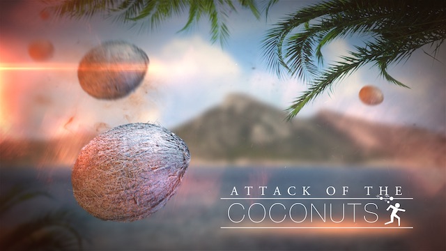
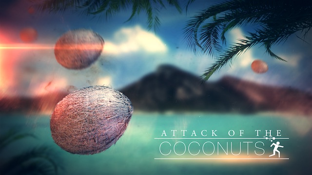
Another vital aspect to achieve a credible motion graphic design is to simulate the characteristics of a real camera. Your audience is used to the behavior of a camera and also people that have nothing to do with the film industry subconsciously connect what they see through a good virtual camera to things they know from the real world. A clever motion graphic designer would use this aspect to furthermore add realism to his work.




4. Natural animation
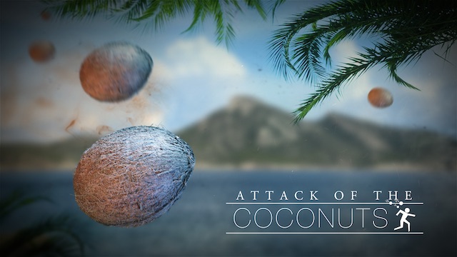
Just like it’s important to add some imperfections to your static design, you should also make the animations of your motion graphic less linear and artificial. Take a look at your animations. Do your objects move like they would do in real life? Do they behave physically correct? Or do they look like being generated by a machine? What is being produced by a computer looks technical and mechanical unless you put a lot of effort into making it dynamic and natural. And that is exactly your task in the post-processing of your animations.
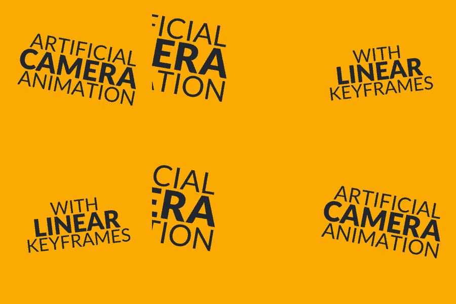
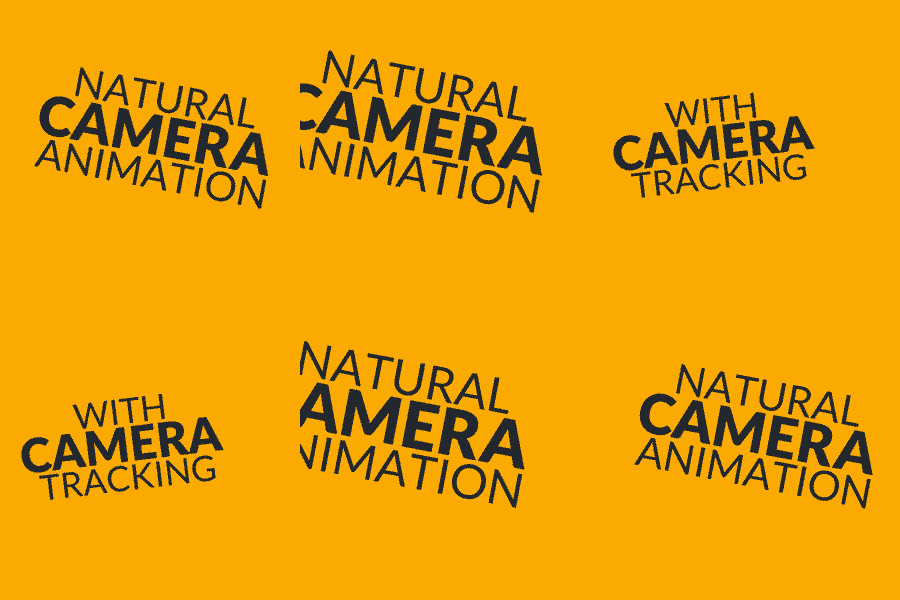
Try to humanize your animations and take care that your design is always in motion! If there is nothing moving in the middle ground, establish some motion in the background and foreground. Never let your design come to a deadlock! Nature is always in motion. Motion graphics should always be in motion.
5. Real life footage and textures
Incorporate material of real life to quickly enhance your design while setting it in constant motion. Footage of moving liquids and flying particles have turned out to be an effective way to increase the realism of motion graphics. Their natural and random behavior is exactly what we need to give our design that final touch of credibility. I always work with real life footage and textures. Even by using such footage very subtle in the background of your work you can dramatically increase the quality of your design. I think the road to success is to combine clever handmade animations with real life movements and characteristics from natural footage and textures. That way you can for example transport your message via animated text objects inside a real natural environment.

Footage can also have an inspiring effect. By imitating the movements and the look of the real life recordings you can quickly transfer that natural behavior on your animated objects. I think a motion graphic designer needs that kind of inspiration and the random behavior of real footage. We don’t work with a static medium. Our medium changes over time. We cannot control every single frame so why shouldn’t we let nature do that job for us? It’s not all about just imitating nature. We can also incorporate nature directly into our design. This is the most effective way to make motion graphics credible and natural.
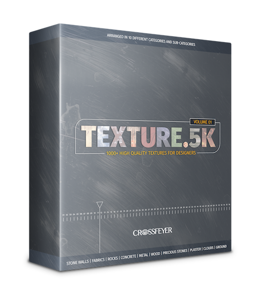
Do you need some free textures? Click here to download 30 samples from our Texture.5K collection (97 MB ZIP-File). Play around with these textures and provide your designs with some perfect imperfections…
Summary
Avoiding plain colors, working with light, real camera characteristics, natural animation and real life footage/textures are the 5 ways that give your motion graphics more naturalness. Learn how to use these techniques, try to implement some of them in your next project and see how they will gradually improve the credibility and visual quality of your motion graphics.
This article is part of our ebook MOTION GRAPHICS DESIGN ACADEMY. If you liked this article and want to support us, please share it with your friends and colleagues!


